


The Best Color Schemes for Every Space
Understanding Color Theory
Color theory is a fundamental aspect of design that serves as the foundation for creating effective color schemes in various spaces. At its core, color theory examines how colors interact, influence perception, and can be harmoniously combined to achieve desired effects. The color wheel is a crucial tool in understanding these relationships, illustrating the spectrum of colors and their connections.
Colors can be categorized into three primary groups: primary, secondary, and tertiary colors. Primary colors, which include red, blue, and yellow, are the building blocks of the color wheel. By mixing two primary colors, secondary colors such as green, orange, and purple emerge. Tertiary colors are formed by blending a primary color with a secondary color, resulting in hues like red-orange and blue-green. Understanding these groupings allows designers to explore various combinations and pairings.
Complementary colors are tones that lie opposite each other on the color wheel, such as blue and orange. These pairs create high contrast and can be visually striking when used strategically. Alternatively, analogous colors are located next to each other on the wheel, such as blue, blue-green, and green. This combination tends to produce a more harmonious and serene look, making it ideal for spaces intended to promote relaxation.
Triadic color schemes consist of three colors evenly spaced around the color wheel, providing a vibrant yet balanced visual effect. For instance, utilizing red, yellow, and blue together can create a lively atmosphere. Utilizing knowledge of these color interactions empowers designers and homeowners alike to craft spaces that reflect personal style while evoking certain emotions.
Choosing the Right Color Scheme for Different Spaces
Selecting an appropriate color scheme is crucial as different spaces in our homes or workplaces evoke distinct moods and functions. Color influences human behavior and emotions, making it essential to consider how hues impact the ambiance of each environment. In this section, we will outline the principles behind choosing color schemes tailored to specific spaces such as living rooms, bedrooms, kitchens, and offices.
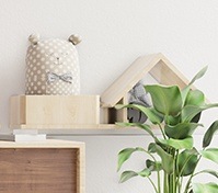
Starting with the living room, this space serves as a central gathering area for family and guests, making Color Schemes an essential element in creating the right atmosphere. The right Color Schemes can foster warmth, comfort, and a welcoming environment. Popular Color Schemes for living rooms include earth tones, soft neutrals, and muted shades of blue, all known for their calming effect.
These Color Schemes help create a relaxing space that encourages conversation and connection. Choosing balanced Color Schemes also enhances natural light and complements furniture, making the living room feel more open and inviting.
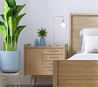
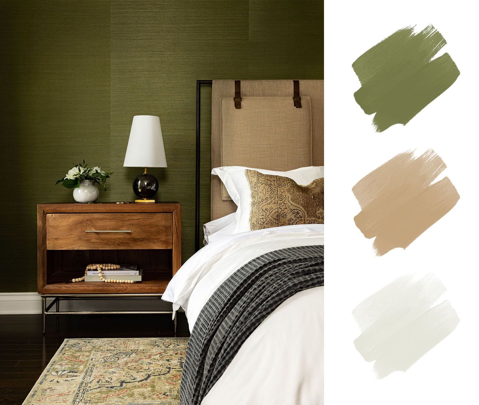
When it comes to bedrooms, the goal is typically to create a serene environment conducive to rest and rejuvenation. Cool colors like soft greens, blues, and lavender are known for their calming properties, promoting better sleep quality. Additionally, darker hues can enhance coziness; however, they should be balanced with lighter accents to avoid overwhelming the senses.
Kitchens, often viewed as the heart of the home, benefit from vibrant, energetic colors that stimulate appetite and creativity. Shades of yellow, orange, and even red can invigorate the space, encouraging social interaction during meal preparation. Alternatively, a clean palette featuring whites and grays can create a modern, spacious feel, ideal for smaller kitchens.
Finally, office spaces require hues that promote focus and productivity. Deep blues and greens are often recommended, as they provide a balance between stimulation and tranquility. These colors not only enhance concentration but also minimize stress, making them suitable for intense work environments.
Ultimately, the selection of a color scheme in various spaces should align with the intended function and desired atmosphere. Understanding the psychological effects of color can guide individuals in making informed choices that enhance their environments significantly.
Trending Color Schemes and Combinations
In the ever-evolving world of interior design, staying updated with trending Color Schemes is essential for enhancing the aesthetic appeal of any space. Modern interiors often highlight Color Schemes that reflect current influences from home décor, fashion, and graphic design.
One of the most popular Color Schemes today includes pastel palettes. These Color Schemes, featuring soft shades like mint green, blush pink, and lavender, create a calm and inviting atmosphere. Such Color Schemes not only add visual harmony but also bring a sense of tranquility, making them ideal for relaxation areas like bedrooms and living rooms.
On the other hand, bold and vibrant colors are making a significant comeback. Colors like deep teal, striking fuchsia, and radiant yellow lend an invigorating energy to spaces. These dynamic hues are particularly effective in areas intended for social interaction, such as dining rooms and entertainment spaces, where they can foster an energetic and lively ambiance.
Additionally, earthy tones have gained popularity for their grounding qualities. Shades such as terracotta, olive green, and warm browns evoke a connection to nature and are frequently utilized in minimalist and organic styles. This trend can beautifully complement spaces that incorporate natural materials like wood and stone, enhancing a cohesive and inviting environment.
Monochromatic schemes, characterized by varying shades and tints of a single color, continue to be a staple in contemporary design. Such palettes allow for a refined and sophisticated look, making them ideal for offices or formal living spaces. An example includes using different shades of blue to create depth, where lighter tones can bring airiness while darker shades add elegance.
Embracing these color combinations can significantly elevate any environment, making careful selection and application integral to design success.
Tips for Implementing Your Chosen Color Scheme
Successfully implementing a color scheme in any space requires thoughtful consideration and a strategic approach. When selecting a color palette, it is important to evaluate how various shades interact within the context of balance and proportion. Opt for a dominant color to set the foundational tone, and then select one or two supporting colors that harmonize with it. This ensures that your chosen palette does not overwhelm the senses but rather enhances the overall environment.
Another critical aspect to consider is saturation; the intensity of a color can greatly influence the mood of the space. Lighter, less saturated hues often create a soothing atmosphere, while vibrant, saturated colors can energize a room. When painting walls, consider using lighter colors to make a room feel more spacious, reserving darker shades for accent walls or smaller areas to add depth and contrast.
Textiles also play a vital role in achieving a cohesive design. Incorporate your selected colors through various fabrics, such as curtains, cushions, and upholstery. This can create an inviting and coordinated look throughout the space. For instance, if your color scheme includes soft grays and blush pinks, using throw pillows in these colors can help to tie the room together without overwhelming it. Additionally, consider the textures of these materials, as they can manipulate the perception of color and enhance visual interest.
Decor items, like art pieces and decorative accents, should also reflect the chosen color scheme to elevate the design further. Ideally, many smaller decor items should align with your primary palette, while larger pieces may introduce a neutral base that balances the overall theme. Accessories should complement rather than compete with the color scheme, maintaining harmony in your space.
Transform your space with the perfect color schemes—start designing today!
Discover the best color schemes for your home and elevate your interiors now!